CHAPTER 2
How to Design User-Friendly Website Architecture
A Comprehensive Guide on Accessible Web Design
Explore The Guide
When most people think about website design, they think about the aesthetics — color schemes, images, layout, text size, and fonts. But there is so much more going on behind the scenes that contributes to good design. Website content architecture — or how a site’s pages are structured and linked together — can make a big impact on your site’s user experience, accessibility, and search ranking.
Imagine you’re trying to locate a doctor’s office for your first appointment. What are the landmarks or navigation features you’d use to quickly find what you’re looking for? In a perfect world, the building would be properly labeled for reference from the street, parking spots marked for visitors, and all offices would be properly named. All this guidance would help you to find the office quickly and easily.
Your website’s user journey is much like the above scenario. Can first-time visitors to your site find what they are looking for? Are there clearly marked steps to help them complete tasks, such as subscribing to services, making a purchase, or filling out forms? What about individuals with disabilities who rely on assistive technology, such as a screen reader — can they navigate your site?
To help you answer these questions and improve your site’s accessibility and user experience, we put together this quick guide on website architecture.
What Is Website Architecture?
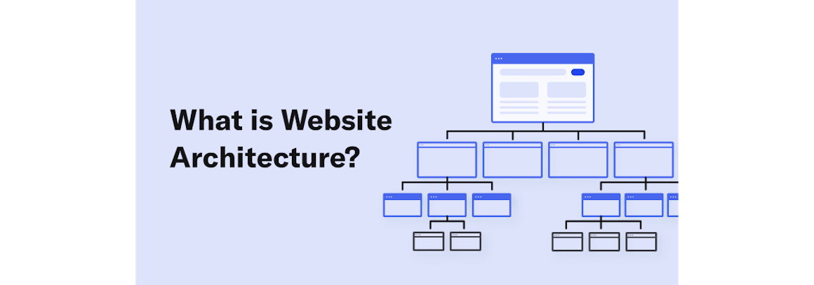
What are we talking about when we say “website architecture,” and why is it important? Website architecture, in its basic form, is how a site’s pages are structured and linked together to ensure that end-users and search engine crawlers can effectively navigate to the information they are looking for.
While you may be thinking that the navigation design of your website is clear and the path is easily accessible, if you have pages that are several clicks away from your home page, it’s possible that without proper linking, users may get lost along the way. Any ambiguity throughout the journey will ultimately lead to frustration and higher bounce rates. Your site visitors will look for information elsewhere, including your competitors’ sites.
Let’s think back to the hypothetical office visit. Imagine you’ve identified that your destination is on the third floor, and that’s the only information you know. Do you turn left or right once on that floor? Is there any other information you may need to efficiently get where you’re going? The same thought process applies to website architecture design.
Proper website architecture also indirectly enhances search engine optimization (SEO). In general, the fewer clicks it takes for users to reach any page on your site, the better. Googlebot and other spiders also rely on site architecture SEO elements to find and index all your pages and rank your site in search results.
How Does Site Architecture Relate to Web Accessibility?
It’s important to note that usability is a key tenet of accessibility. Sound website architecture strengthens and enhances user experience for all site visitors, regardless of their ability.
Accessibility improvements, such as consistent navigation and clear sitemaps, are features that can improve the browsing experience, especially for those relying on assistive technologies.
Website navigation allows visitors to easily flow through your site from one page to another, without frustration. When it comes to site navigation, a good rule of thumb is allowing visitors to find the information they need in three clicks or fewer.
Additionally, make sure your website’s navigation, link displays, and the consistency therein assist individuals of all abilities.
How to Create an Accessible Website Architecture Plan
When designing your website information architecture, simplicity is the key. Below are a few steps to keep in mind as you create your architecture plan:
- Define the scope of your project. Are you designing a new website or refurbishing an existing site?
- Interpret the business goals. How will this impact the bottom line?
- Create your end-user persona. Is every element perceivable and operable by visitors of varied abilities?
- Identify any gaps. Use free testing tools, such as Treejack, to get a comprehensive understanding of a user's journey through your website and identify gaps in your architecture.

Website Hierarchy
Day one of planning your accessible website architecture should include establishing your site hierarchy. As you add more pages, stick to that hierarchy.
An easy way to organize your site’s architecture is with category pages. If you’d like to add a new page to your website, make sure it easily fits under an existing category — if it doesn’t, create a new category. Without proper buckets for new pages, there is a tendency for them to get missed by both users and SEO crawlers.
Website Menu Design
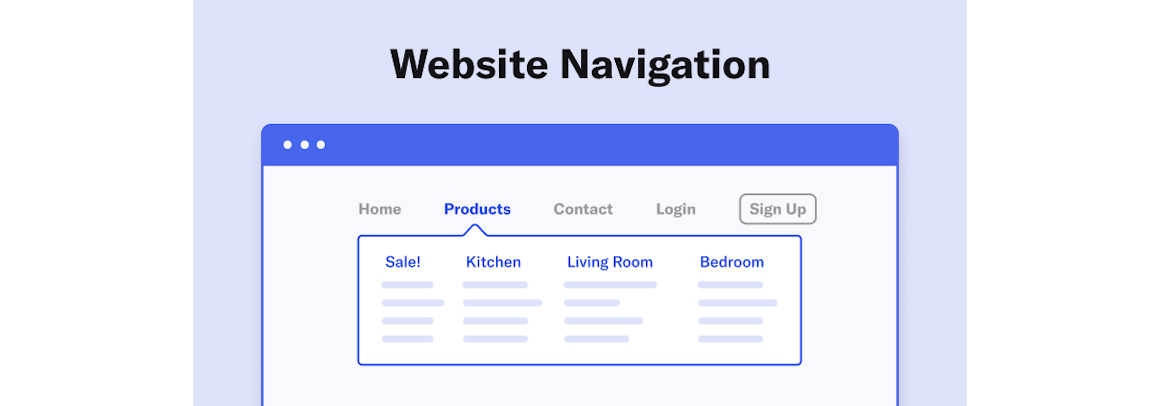
he website menu, which reflects a website’s structure, plays a key role in site navigation and accessibility. Use semantic markup to make your menu accessible to users, search engines, and assistive technologies.
Semantic markup, as its name suggests, describes the meaning and type of each element, making it easy for users and machines to understand and adapt content. For example, when coded semantically, menus can easily adapt to increased or decreased fonts, mobile views, and assistive technologies.
There is some wiggle room when it comes to designing website menus. Depending on the end goal, you can choose between ordered and unordered lists.
- This is an unordered list item.
- This is also an unordered list item.
- This is an ordered list item.
- This is also an ordered list item.
This structural information allows screen readers to announce the number of menu items and provide corresponding navigation functionality.
If you have a complex navigation with many subcategories, consider using a mega menu design. Typically displayed in a two-dimensional dropdown layout, this is the easiest and most comprehensive way to display the many choices and reveal lower-level site pages at first glance (as mega menus tend to contain both first-level and second-level categories).
When you code your website menu with correct semantic markup, any responsive elements and features will apply to the mobile menu. Designing your website menu with mobile responsiveness will allow for the site page navigation to be dynamically expanded or retracted as part of the automatic responsive design layout.
Navigational Elements
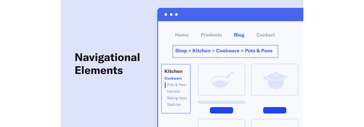
Your website architecture heavily relies on how you link your pages together. It’s recommended to use internal linking to connect your website’s content to other pages on your site.
It’s also important to ensure that your navigation links are coded in HTML — not JavaScript or Flash. Google can only partially crawl and index JavaScript. Using HTML is a wise navigation design technique for increased usability and SEO.
XML and HTML Sitemaps: What Are They, and How Do They Help?
A sitemap is a holistic overview of your website with all major sections and links in consecutive format. A sitemap helps you to stay compliant with the Web Content Accessibility Guidelines (WCAG) and allows search engines to find, crawl, and index your website’s content.
As it pertains to formatting, an XML sitemap is coded specifically for web crawlers, and an HTML sitemap is coded for humans. While the XML file is easily decoded by search engine crawlers, the HTML-coded sitemap will assist anyone who needs some direction on your site to find what they are looking for. Your sitemap is essentially the instructions for visitors to find your office!
Reviewing Your Website Architecture Plan
Website architecture design plays a decisive role in your site’s accessibility, user-friendliness, and search engine visibility. Whether you’re starting fresh or working on an existing site, it’s crucial to have a strong foundation.
On a final note, remember to test your site for overall accessibility. You can use AudioEye’s free scanner to check your website now.
Chapter 3: Accessible Web Page Content
Read Other Chapters
See all chapters from the Comprehensive Guide on Accessible Web Design.