CHAPTER 1
Accessible Colors
A Comprehensive Guide on Accessible Web Design

Explore The Guide
Did you know that 93% of online consumers base their buying on color and appearance as their main deciding factors? When users visit your website, the color scheme makes a big impression and directly impacts your bottom line. From increasing brand recognition and growing loyalty to persuading a customer to buy a product or service, there’s a lot of power in color choice. Choose a website color scheme that will make your site more accessible by taking note of the following considerations.
What Are Color Schemes, and Why Are They Important?
A color scheme is a combination of hues that are implemented in specific design contexts, such as a site’s layout. Website colors are important for several reasons, the first being color psychology. Specific combinations of colors, like a brightly pigmented or dark and bold palette, can evoke feelings and influence how people interact with your brand and website. Another way color impacts how people interact with your site is related to digital accessibility, or web color accessibility.
To ensure your web design colors can be interpreted by everyone, you must keep people with disabilities (26% of Americans) and certain conditions in mind. For example, a person with color blindness may see website hues differently. Some of the most common types include red-green and blue-yellow color blindness, which make it difficult for people to differentiate between those tones when they’re placed together.
Web color accessibility in design considers your audience and any condition or disability they may have in perceiving pigmentation.
What Are Accessible Website Colors?
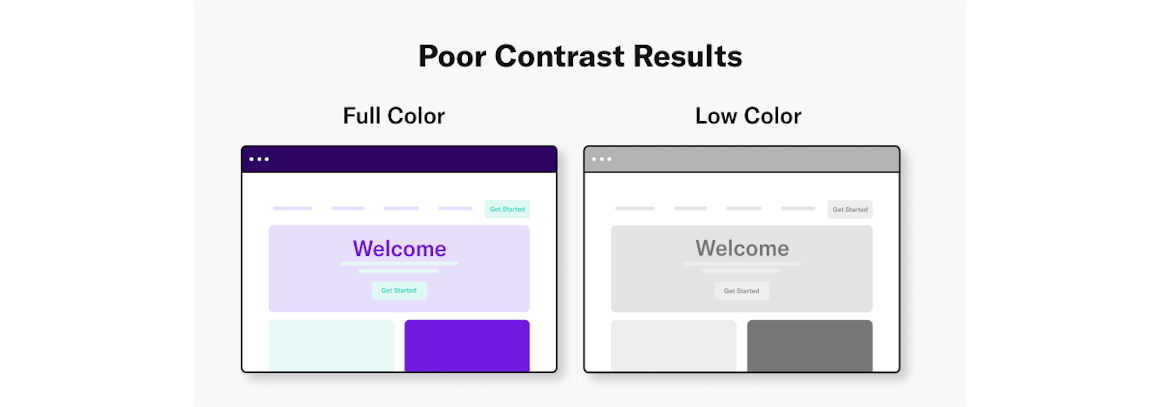
When it comes to creating an accessible website, color choice matters. Including accessible hues in your design palette will make your site more usable to people who may have disabilities like vision impairment or low vision.
The Web Content Accessibility Guidelines (WCAG) outline various recommendations for color accessibility, including guidance for color contrast ratios, luminance, backgrounds and color spacing in order to make a site more accessible to those with any sort of vision deficiency. The following aspects of website color schemes can help you design with accessibility in mind.
Color Contrast for Websites
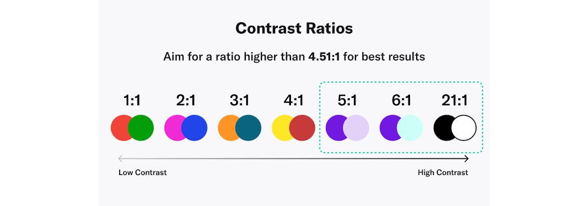
To make your website color-accessible, your contrast ratio must be compliant with WCAG guidelines. A contrast ratio determines how bright or dark colors appear on a screen. They can range from 1 to 21 (written as 1:1 and 21:1, respectively). The first number in the ratio indicates what the relative luminance of the light colors is, and the second represents the relative luminance of dark colors. WCAG recommends that the minimum ratio be 4.5:1 for text and interactive elements. This WCAG color contrast ratio will meet the needs of color-blind or visually impaired users.
This guidance also states that pigmentation should not be the only indicator for interactive elements, which means that an additional non-color element, such as an asterisk or a symbol, should be used. As for color blindness considerations, since the red-green variant is the most common, avoid placing green on red or vice versa.
When designing a website, it’s essential to check color contrast ratio, color as an indicator, and red/green and blue/yellow hues to address the contrast portion of web accessibility.
Visually Friendly Color Combinations
Start figuring out how to choose color combinations for a website by focusing on background colors, text and typeface colors, calls to action (CTAs) and buttons. The following dos and don’ts will help you choose the best color scheme for your website.
DO start the process by identifying your primary brand color.
DO aim for more white space to help boost readability.
DO use varying saturations of your brand’s main hues to increase brand loyalty.
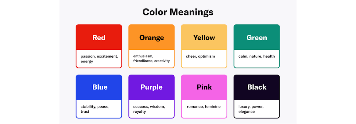
DO keep in mind that certain colors tend to hold certain meanings:
- Red: passion, excitement, energy
- Orange: enthusiasm, friendliness, creativity
- Yellow: cheer, optimism
- Green: calm, nature, health
- Blue: stability, peace, trust
- Purple: success, wisdom, royalty
- Pink: romance, feminine
- Black: luxury, power, elegance
DON’T let a color combination for a website get in the way of readability.
DON’T use low-contrast text. It can strain the eyes and make your page less accessible overall.
DON’T use digital black typeface or pure black on a pure white background — the stark contrast may cause eye strain. Instead, consider using a more muted version of the primary color you use in your branding for your background color.
Designing for Readability
There is more to web accessibility than color schemes — site readability is affected by screen resolution, brightness levels, and devices. Test colors on the various platforms consumers use to access your site to ensure they’re adjusted for optimal readability.
Color Accessibility Exceptions
There are some exceptions to the color accessibility guidelines outlined by WCAG.
- Color contrast ratio requirements are not mandated for logos or incidental graphic elements because they are not necessarily essential for the user to understand the content or functionality.
- Text that is part of a logo does not have a minimum contrast requirement.
- Text that is part of disabled buttons does not need to meet the minimum contrast ratio. While there are a few exemptions, try your best to follow best practices to avoid any accidental violations of color accessibility in web design.
Is Color Accessibility in Web Design Mandatory?
While WCAG is not a legal mandate, its guidelines are increasingly used in lawsuits related to the Americans With Disabilities Act (ADA). It’s important for businesses to conform to digital accessibility guidelines as best as possible or their risk of lawsuit can increase, as in the Domino’s digital accessibility case. With approximately 12 million visually impaired people (40 years and over) in the U.S., there is a strong case for creating accessible web content.
However, you’re designing a website for a U.S. federal government agency or an organization that works with one, color accessibility in web design is mandatory because of the Section 508 law. Section 508 ensures that individuals with disabilities have full access to digital information and communications.
How to Choose a Color Palette for a Website
Now that we’ve unpacked how colors can evoke certain meanings and touched on some of the dos and don’ts when it comes to visually friendly combinations, it’s time to choose a color palette for your website. Start with primary colors that represent your brand and then choose additional tints from the main color wheel. When selecting these hues, consider schemes that will work on both light and dark modes across devices. The following steps will help you choose a color palette for your website.
Consider Types of Color Schemes
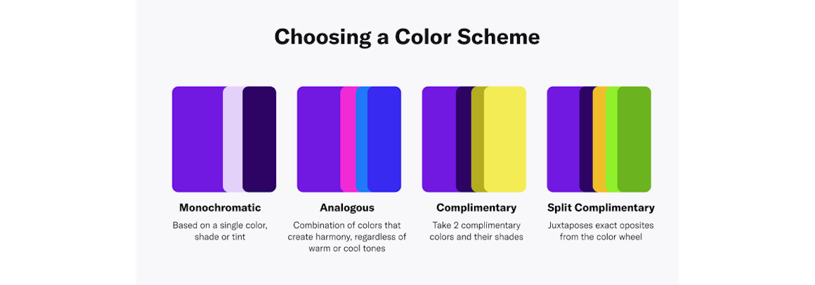
When choosing your website color combinations, it may be helpful to follow one of these schemes:
Monochromatic
A monochromatic color scheme is based on a single color, shade or tint. This combination of similar colors can bring a sense of relaxation and cohesion to the user because of the lack of definition in this scheme. On the other hand, this configuration can also be stimulating, depending on the primary hue that is chosen. You may also try taking your base primary color, then finding lighter and darker shades by making incremental changes to it by adjusting its HSL (hue, saturation, and lightness).
Analogous
An analogous scheme uses color combinations that create a sense of harmony, regardless of whether the hues are warmer or cooler. Consider a palette with red, orange and yellow for warmth, or a cool one with green, blue and violet.
Complementary
A complementary color palette starts with two main hues and then branches out to their various shades, tints and tones. Complementary color schemes can add depth and character to a page.
Split Complementary
A split complementary color scheme juxtaposes exact opposite colors from the color wheel. Combinations of red and green, violet and yellow, and blue and orange are examples of opposites. Keep in mind, however, if you choose this type of color scheme, it may not be compliant with color accessibility guidelines.
RGB vs. HEX Value vs. HSL
There are a few approaches that can be taken when it comes to finding the perfect color. RGB (red, green, blue) is a pigmentation gamut of these colors frequently utilized when designing websites and other digital platforms. HEX (hexadecimal), on the other hand, is a shorter code for RGB, and it is usually a number automatically generated by the program you’re using. Many designers focus on creating a color palette with HEX values, but a less complicated alternative to achieve consistency is to utilize HSL. HSL (hue saturation lightness) is a user-friendly way to understand color codes without having to decipher HEX codes or RGB. Consider utilizing HSL to find the perfect color if utilizing RGB and HEX are challenging.
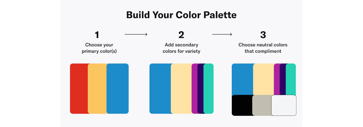
Build Your Color Palette
You can build a solid color palette for your website by focusing on primary, secondary and neutral colors:
Primary
Primary colors are the main hues on the color wheel: red, yellow and blue. These will be the prominent colors used throughout the site. Be sure to pick a pigmentation that will evoke a feeling you want your site visitors to experience as they browse your site.
Secondary
Secondary colors are made from the mixing of two primary ones. For example, red and yellow create orange, and red and blue create magenta. If your branding has two primary colors, adding some flares of secondary ones may make sense for your website.
Neutral
Neutral colors don’t typically fall on the color wheel and are considered hues without an “actual color.” These are the browns, tans, grays, blacks and whites of the spectrum and tend to complement secondary and primary colors. You can use them as backgrounds or font hues to create a more neutral feeling.
Reviewing Your Website Color Scheme for Web Accessibility
A lot of thought and consideration must go into designing a website — especially when it comes to the color scheme. Not only do you want to align your site with your brand, you want to drive your user to take certain actions, and the site’s colors can have a lot of influence on a person’s behavior.
Additionally, following website accessibility guidelines on color can make your site more accessible to all types of consumers, including those who may have visual impairments. WCAG recommendations are a good reference to create web design colors that are digitally accessible. AudioEye provides users with a Usability Toolbar with options to adjust the color contrast and the color shift, as well as Contrast to sharpen images.
Chapter 2: Accessible Website Architecture
Read Other Chapters
See all chapters from the Comprehensive Guide on Accessible Web Design.