Free Accessibility Checker Tool
Check Your Color Contrast
Use the color contrast checker below to see if your colors meet WCAG requirements.

Preview:
How Does This Work?
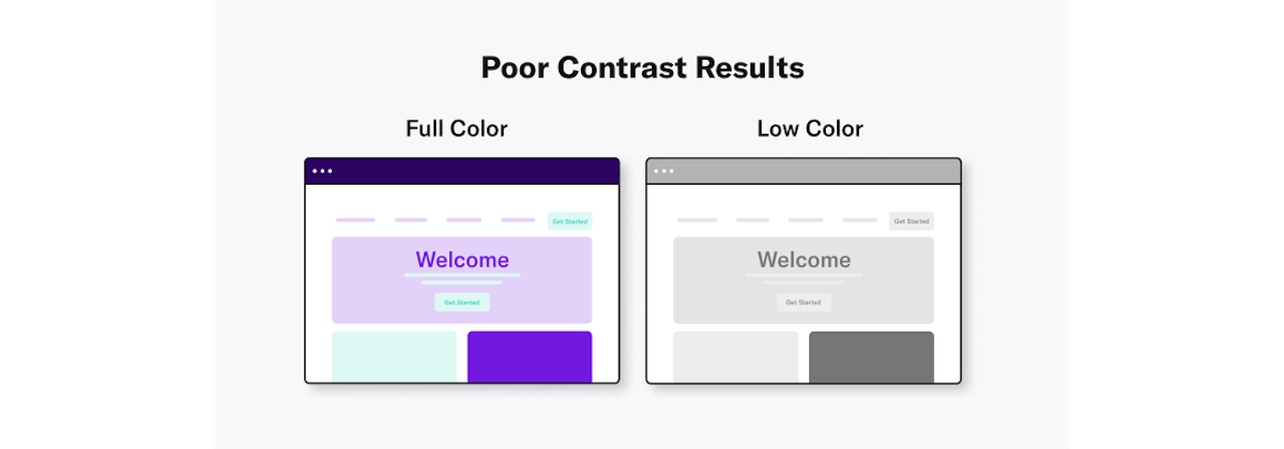
The more contrast you have between your text and UI elements and background colors, the more accessible it is for everyone.
Your Ratio
Your ratio is undefined:1. Your colors meet WCAG requirements. GREAT.
Small text compliance level AA fail. Small text compliance level AAA fail.
Large text compliance level AA fail. Large text compliance level AAA fail.
Your Compliance
Small Text
Level AA
fail
Level AAA
fail
Large Text
Level AA
fail
Level AAA
fail
Preview Colors in Grayscale
Contrast Ratio Scale
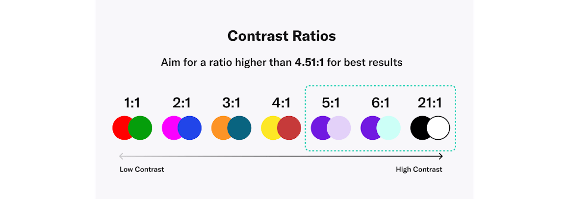
Contrast ratio refers to how bright or dark colors appear on screens. The more scientific definition is that contrast is a ratio of the luminance of the brightest color to the darkest color that the system can produce. Contrast ratios range from 1 to 21 (written as 1:1 and 21:1). The first number, L1, refers to the relative luminance of light colors while L2 is the second number that refers to the relative luminance of dark colors.
LOW
Your Ratio
:1
HIGH
1
3
4.5
7
21
We'd love to get your thoughts!
Is there anything you'd like to see improved from our color contrast checker?
How Accessible Is Your Site?
Color contrast is just one small piece of what makes your website accessible. Want to get the full picture of your website's accessibility? Scan your site now with our free website accessibility checker:
Tips on using accessible colors and color contrast on your website

Choose The Right Color Scheme
A color scheme is a combination of hues that are implemented in specific design contexts, such as a site’s layout. Color plays an important role in making your content accessible to people with visual impairments. Web color accessibility in design considers your audience and any condition or disability they may have in perceiving pigmentation.
When it comes to creating an accessible website, color choice matters. Including accessible hues in your design palette will make your site more usable to people who may have vision impairment or low vision.
The Web Content Accessibility Guidelines (WCAG) outline various recommendations for color accessibility, including guidance for color contrast ratios, luminance, backgrounds, and color spacing in order to make a site more accessible to those with any type of vision deficiency. The following aspects of website color schemes can help you design with accessibility in mind.

Aim For a Contrast Ratio of 4.5:1 or Higher
A color contrast ratio determines how bright or dark colors appear on a screen. They can range from 1 to 21 (written as 1:1 and 21:1, respectively). The first number in the ratio indicates what the relative luminance (or brightness) of the light colors is, and the second represents the relative luminance of dark colors. WCAG recommends using 4.5:1 as the minimum ratio for text and interactive elements.
Find Visually Friendly Color Combinations
Start figuring out how to choose color combinations for a website by focusing on background colors, text and typeface colors, calls to action (CTAs), and buttons.
The following dos and don’ts will help you choose the best color scheme for your website:
DO:
- start the process by identifying your primary brand color.
- keep in mind that certain colors tend to hold certain meanings.
- aim for more white space to help boost readability.
- use varying saturations of your brand’s main hues to increase brand loyalty.
DON'T:
- let a color combination get in the way of readability.
- use low-contrast text. It can strain the eyes and make your page less accessible overall.
- use a digital black typeface or pure black on a pure white background — the stark contrast may cause eye strain.
There is more to web accessibility than color schemes — screen resolution, brightness levels, and device types also affect site readability. Test colors on the various platforms to ensure they’re adjusted for optimal readability on different devices.
Know The Color Contrast Accessibility Exceptions
There are some exceptions to the color accessibility guidelines outlined by WCAG:
- Color contrast ratio requirements are not mandated for logos or incidental graphic elements because they are not necessarily essential for the user to understand the content or functionality.
- Text that is part of a logo does not have a minimum contrast requirement.
- Text that is part of disabled buttons does not need to meet the minimum contrast ratio. While there are a few exemptions, try your best to follow best practices to avoid any accidental violations of color accessibility in web design.
Want to learn more about color contrast and its impact on the user experience?
Read Our Blog