CHAPTER 3
Accessible Web Page Content
A Comprehensive Guide on Accessible Web Design
Explore The Guide
While creative design and high-quality content play important roles in attracting both new and returning customers, user-friendly web page content is the foundation of good user experience (UX) on the web. If your website’s content is not easy to find, navigate, and consume, you could unintentionally drive away visitors and revenue.
Usable website content also goes hand in hand with basic online accessibility principles, which were created to remove barriers and help users with disabilities take full advantage of web content. There are 61 million adults in the United States living with a disability, yet, according to a recent accessibility analysis, only 3% of top 1,000,000 sites meet web accessibility requirements.
More than that, website accessibility is a legal requirement under the Americans with Disabilities Act (ADA).
In order to make your website accessible to every user, regardless of ability — and to protect your business from lawsuits — create and publish user-friendly web page content that meets accessibility standards.
In this article, we share the basics of building user-friendly web page content: from semantic HTML best practices to proper page formatting, including easily accessible headings, typography, and layouts.
Semantic HTML: Why It Matters
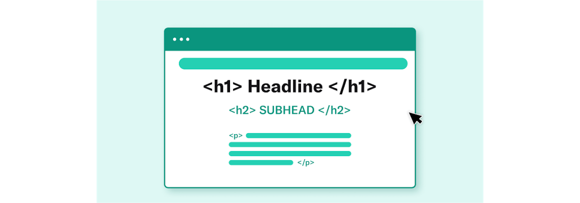
Semantic HyperText Markup Language (HTML) accessibility is one of the key drivers of user-friendly web page content. Semantic HTML introduces the actual meaning of content on a web page with semantic tags (those that have meaning related to human language and logic) rather than simply defining its appearance with non-semantic tags (those that are read by computers and have no human meaning).
For example, <p> is a common semantic tag that indicates a section of text is its own paragraph. This tag helps the user understand they are reading an individual paragraph, while letting the browser know how to visually display it.
A non-semantic tag like <b> (which indicates that text should appear bold) simply defines how text should appear in the browser, but it doesn’t provide additional meaning to the user.
Structured, semantically correct HTML helps search engines and assistive devices, such as screen readers, to understand the type of content you’re presenting, as well as the context of this content.
With HTML 5, you can add semantic meaning to an entire web page using elements, such as:
<article>
<aside>
<details>
<figcaption>
<figure>
<footer>
<heading>
<main>
<mark>
<nav>
<section>
<summary>
<time>
These HTML accessibility elements make it easier for browsers and assistive technologies to understand what your website content is saying and how different elements of that content relate to one another. For example, semantic HTML can provide screen readers with structured information, such as listing the hierarchy of headings on a page (<h1> - <h6>), defining a footer of a web page or section (<footer>), or providing additional navigation controls (<nav>) for data tables.
Without semantic HTML, people with disabilities using assistive devices will have a difficult time understanding how your web page content is structured and what it represents.
Page Formatting: How It Helps Your Reader
Proper page formatting is another essential element to creating user-friendly, accessible website content. Without clearly defined formatting for page headings, typography, layouts, and hyperlinks, your users will struggle with reading and engaging with many important elements of your content.
Page Headings
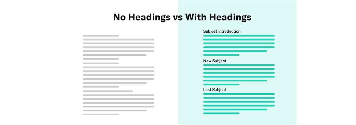
Page headings allow readers to understand the overall outline of your web pages as well as to quickly scan the page or navigate to sections they are interested in. These headings are categorized into hierarchical, numerical levels ranging from one to six (<h1> - <h6>), with the highest level being an <h1>.
It’s important to note that an <h1> headings tag is most often used to identify the official title of a web page.
To gain a better understanding of website heading design, let’s use this section of the article as an example. Above, the headings “Page Headings” was formatted in a larger text than the rest of the section copy. While this visual cue allows site visitors without impairments to understand the heading’s hierarchical importance and the beginning of a new section, those using screen readers are unable to discern the style change. To ensure site visitors with visual disabilities who are using screen readers can comprehend the intention of this heading, we have semantically tagged it as an <h3> in the page’s HTML.
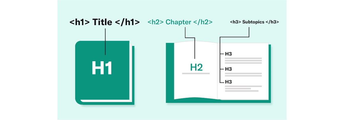
In this case, “Page Headings” is an <h3> because if falls underneath the heading “Page Formatting: How It Helps Your Reader,” which is tagged as an <h2> in the page’s HTML. Think of an <h1> as the title of a book, an <h2> as a chapter, and <h3> - <h6> as subtopics of a chapter.
Other HTML Heading Best Practices
If you’re creating website content that is longer than three paragraphs, use headings to present page structure and make your content scannable for all users, including for people with disabilities. These headings should be clear, concise, and descriptive of the content that follows them.
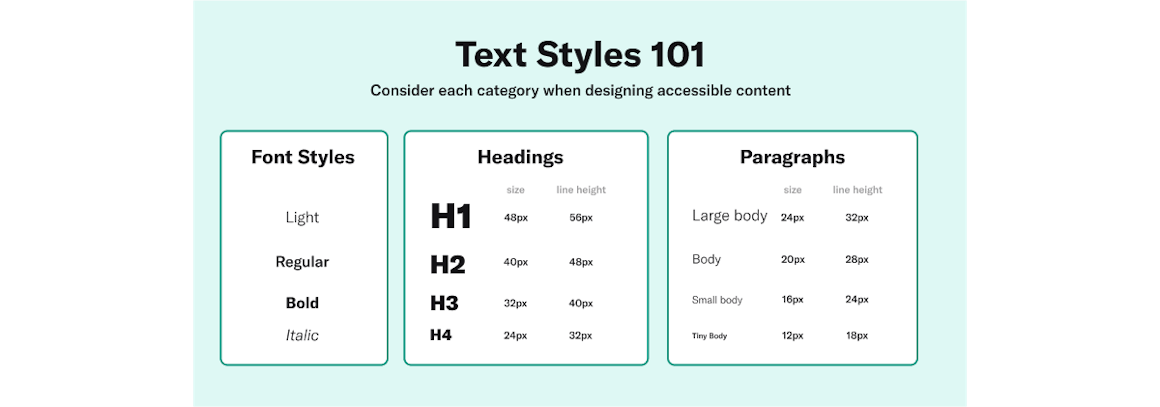
Make sure all your headings are semantically correct and feature the appropriate font size, based on their place in the page content hierarchy.
You can specify the size for any heading with the “style” attribute using the CSS “font size” property.
Typography
Typography is another factor that affects the usability and accessibility of your site. Here are a few common typography best practices:
- Typefaces and styles: Legible and clear typefaces ensure site visitors can comprehend your content. Make sure to select typefaces that are easily readable and can adapt to a variety of sizes and use cases. According to the U.S. Web Design System (USWDS), serif typefaces can be a good choice for long text blocks, while neutral, sans-serif typefaces can be good for user interfaces (UI). Also, avoid long sections of bold, italic, or uppercase text, as these can hurt readability.
- Font size and weight: As a rule of thumb, larger fonts with wider strokes are more legible, even on low-contrast web pages. The World Wide Web Consortium (W3C) recommends starting at 18-point regular-weight text or 14-point bold text. This allows you to utilize a wide range of colors in your web page content, including in titles.
- Line length and height: Proper line length and height can help readers stay comfortable and engaged with your website content. In general, standard texts should feature line lengths around 45-90 characters long, while long-form texts should feature around 66 characters. For line height, headings, and content elements that are no longer than a line or two, use height between 1 and 1.35. Longer texts should have a line height of at least 1.5.
- Text alignment: Text that is right-aligned, centered, or justified (where both the left and right sides of a text block have a clean edge) can be difficult for site visitors to read if incorporated incorrectly. Whenever possible, use left-aligned text for longer sections of copy, as this gives the eye a consistent starting point for each line of text. Centered, right-aligned, and justified text can be used for headings or other short sections of copy that don’t require repeated eye movements.
- Letter spacing: The space between each letter or character (or kerning) in a body of text can sometimes be adjusted for better readability. While this is commonly defined by the typeface designer, certain circumstances require modified text spacing. For instance, smaller text — or uppercase or small-caps text — could benefit from more space between each character, while larger text could benefit from less space.
- Text white space: The white space that surrounds your text plays a role in how users interact with and understand the relationships between the elements of your web page content. If you want to group content together, consider using less negative space. When distinguishing different elements of content, consider adding a bit more breathing room. Additionally, web pages typically use white space rather than indentations to introduce copy.
Other Typography Best Practices
There are many other considerations to keep in mind when writing content that is user-friendly. A common example is using descriptions when adding abbreviations or acronyms to your copy. Both abbreviations and acronyms can sometimes be difficult for readers to decode, especially those who are using screen readers.
Write out any confusing abbreviations for immediate clarity. And before using an acronym, spell out the phrase upon first use, placing the acronym in parentheses right after. For example: Job Access With Speech (JAWS). Also, don’t forget to include the HTML abbreviation tag <abbr> for any abbreviation or acronym you use.
Another best practice is to add accessible hyperlinks throughout your website content. If you plan to include hyperlinks in your text, the link text you use needs to adequately describe the page it is connected to. Avoid adding hyperlinks to “click here” language, as this information is ambiguous and doesn’t provide the user with the right information or context.
- Correct: Learn more about user-friendly web page content.
- Incorrect:To learn more about user-friendly web page content, click here.
Page Layouts and Wireframes
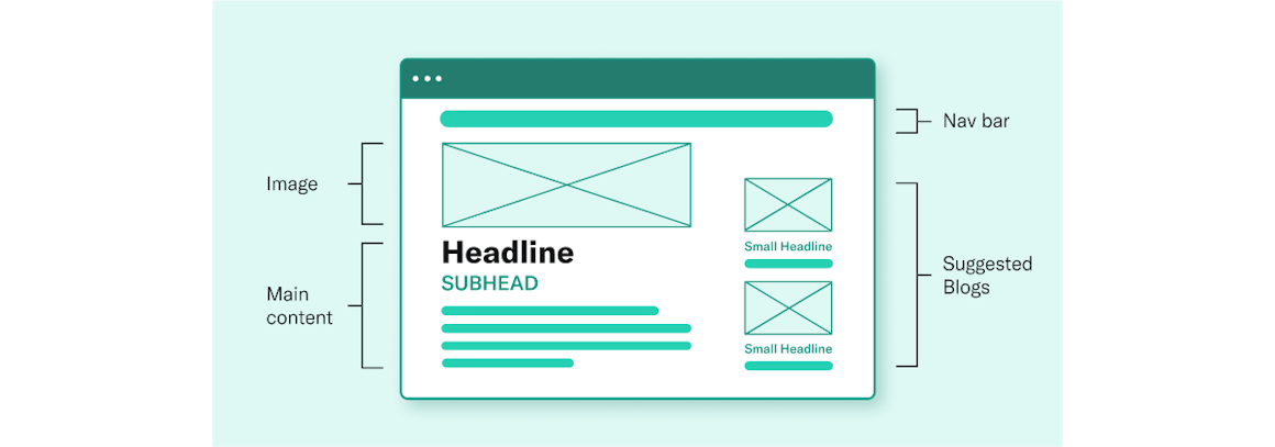
Creating clear page layouts is another crucial aspect of user-friendly web page design. A clear page layout is one that ensures different aspects of your content — including navigation menus, hyperlinks, forms, and text — are in predictable locations and easy for users to identify. Clear layouts allow people with visual impairments or cognitive disabilities to easily view and orient themselves with your website’s content.
To implement clear page layouts from the get-go, it’s best to start by closely analyzing your wireframes (page schematics) at the beginning of the design process. Wireframes allow you to visualize the blueprint of your web page content, including your page structure, headings, typography, and intended user navigation. Wireframes also allow you to conduct testing with different users before launching the site. You can use the feedback on the experience and flow of your page layouts to improve and finalize the structure and design before going live.
User-Friendly Website Content Is Good for All
Creating user-friendly website content doesn’t just benefit people with disabilities who use assistive technologies — it benefits all users who visit your site.
Still unsure if your web page content provides good usability or accessibility? AudioEye is here to help. With our AI-powered accessibility testing, easy-to-read website analyses, and patented algorithms that automatically remedy common accessibility errors, you can easily ensure your pages are user-friendly and up to digital accessibility compliance standards.
In addition, our team of International Association of Accessibility Professionals (IAAP)-certified experts is standing by to guide you through every step of the process.
Chapter 4: Seven Universal Design Principles
Read Other Chapters
See all chapters from the Comprehensive Guide on Accessible Web Design.