Explore The Guide
As one of the most basic elements of web accessibility, hyperlinks help users navigate from one web page to another and access different types of digital content. While creating hyperlinks is easy, making them accessible to all users — including those who rely on screen readers to interact with online content — takes careful consideration. Let’s go over a few best practices on creating accessible links in text, call-to-action buttons, and images.
Types of Links That Need to Be Accessible
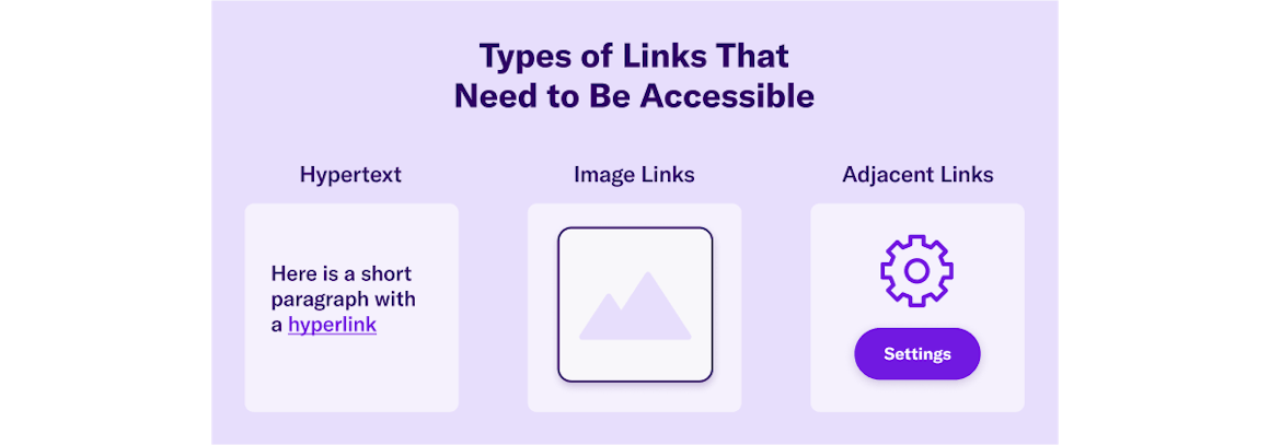
Generally speaking, there are three types of links that need to be accessible:
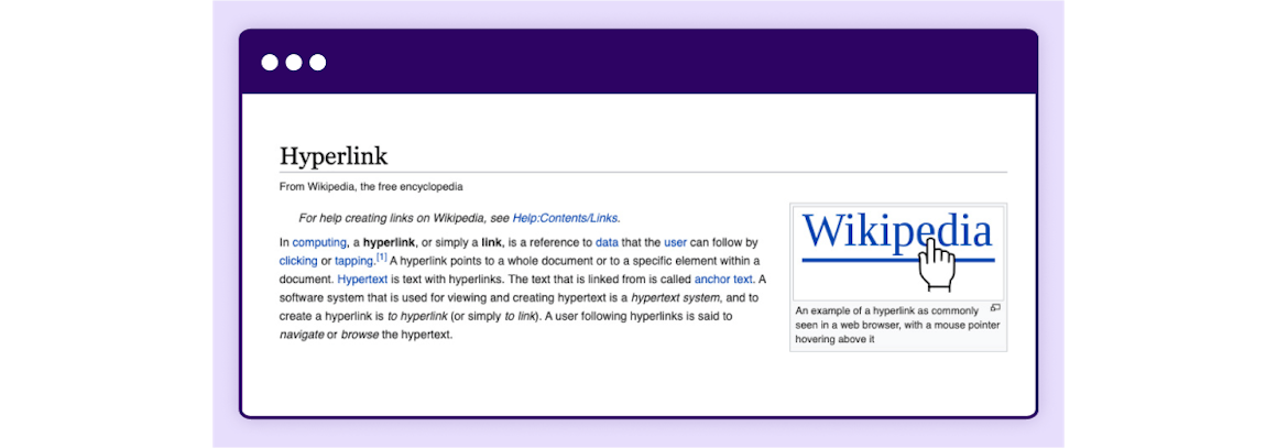
- Hypertext: Links within text, like the example below: the Wikipedia page for hyperlinks with at least 20 links in the text alone.
- Image links: Images, including call-to-action buttons, that link to another page or file.
- Adjacent links: Two links next to each other that go to the same location. For example, an image and the text beneath it linking to the same page.
Anchor Text Best Practices
Anchor text is a linked or clickable text. Here are a few best practices for writing helpful and meaningful anchor text.
Write clear, concise, and descriptive anchor text. Screen reader users may skip the surrounding content and just navigate the links, so make sure your anchor text makes sense out of context.
Don't use the URL as an anchor text. For example, to send site visitors to a “Help Center,” write ”For additional support, visit our Help Center,” instead of ”For additional support, visit our Help Center at https://help.audioeye.com/hc/en-us."
Avoid using general phrases and words, such as "click here" or "more" as anchor text — they don’t provide any helpful information and can confuse screen readers and people who can’t use a mouse or trackpad to click on content.
Finally, make sure your links are easy to spot on the page. For example, all anchor text on this page is purple and underlined. The unique color draws attention to links and underlining text makes it more accessible to people with color blindness.
Call to Action Best Practices for Accessibility
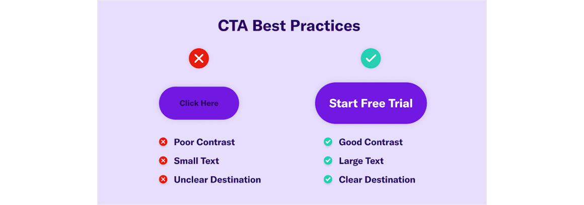
Calls-to-action (CTAs) tell readers what to do next. They generally appear in the text, like in the Help Center example above, or as buttons. Follow the same rules as with anchor text to keep your CTAs accessible.
Use straightforward and descriptive language, making it clear where the link is taking the user. Don't make the common mistake of writing "click here.”
Now let’s go over the design considerations for CTAs.
Designing Accessible Buttons and Linked Images
According to Web Content Accessibility Guidelines (WCAG), images (think logos, icons) and buttons that contain links are considered "functional images."
There are several web accessibility buttons and image best practices, but the most important rule is to always add alt text that tells the user where the link will take them, instead of describing the image. For instance, the alt text for "Start Free Trial" button at the top right of this screen says “Start free trial,” instead of "Purple button reading start free trial."
If you want an image itself to be accessible to all users and search engines (think of pictures and photographs vs buttons), then don't use it as a link and instead add a detailed description of the image in alt text.
You can use Javascript, CSS, or HTML to make buttons or images (linked or not) accessible.
In addition to alt text mentioned earlier, you need to consider color, contrast, and, if relevant, font size and shape when creating linked buttons and images.
When it comes to designing accessible buttons, there are three basic types to consider:
- Primary Buttons: The most important buttons on the page. For example, calls to action that are highly relevant to the page content.
- Secondary Buttons: Actions you would like users to take, such as a free demo request.
- Tertiary Buttons: Buttons of lower priority, such as making changes to account settings.
Ultimately, it's up to you to prioritize buttons on any given page. The key is to make the most relevant and important action steps easily accessible to all users.
Make sure your primary, secondary, and tertiary buttons are similar, but not identical. For instance, all three types can have the same shape, but different colors. One exception is when you are linking to an outside source using their logo. In that case, you don't need to change the logo to conform to your design convention.
Finally, use the same call to action for buttons that lead to the same page. For example, if you have two buttons linking to a single contact page, use "Contact Us" for both, instead of writing “Contact Us” on one and “Email us” on the other.
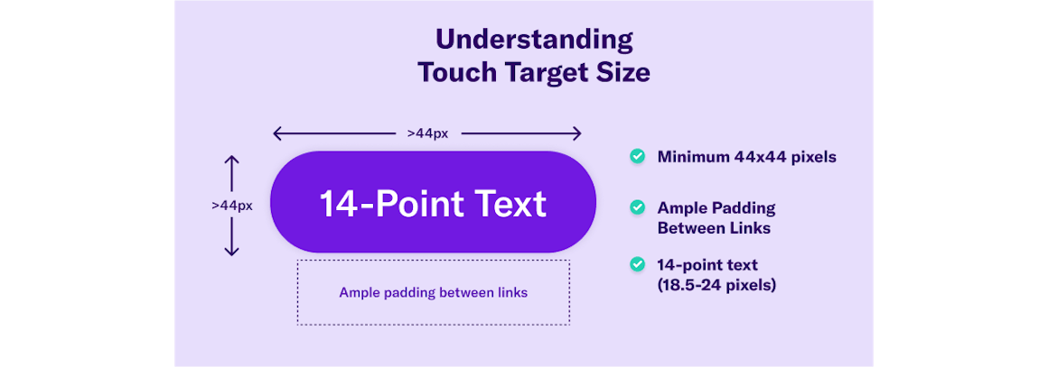
Understanding Touch Target Size Accessibility
Touch target size for accessibility aims to ensure targets — any place with a link, whether on a computer or mobile — is large enough to be clicked on or otherwise accessed by those with mobility, visual, or other disabilities.
The minimum touch target size for buttons and at least one of two adjacent links (or equivalent targets) must be at least 44x44 CSS pixels, per WCAG.
You should also have enough padding between your links to help ensure users don’t click or tap the wrong one by accident. Use empty space as padding, or regular text between linked words in a list.
Links within text, footnotes, and help icons don't need to meet the minimum pixel size, but it's still a best practice to have space between links. For instance, you shouldn't have an anchor link on one word and a different anchor link on the next word.
Although your in-text links don't need to be a minimum of 44x44 pixels, you do need to follow WCAG for font size. In general, 14-point text is the minimum acceptable font size, but you can use any font size within the 14 to 18-point range, or 18.5-24 pixels, respectively.
Using Best Practices to Establish Link Accessibility on Your Site
Link accessibility is essential to ensure WCAG and the Americans with Disabilities Act (ADA) compliance, and to make your content accessible to all users, regardless of ability.
In summary, make sure every link you use is:
- Clearly identified as a link
- Descriptive, but concise
- Designed following minimum-size standards (14 points for font, 44x44 pixels for images)
- Usable by screen readers, keyboards, and people with limited mobility
This may sound like a lot of work, especially if you need to review your website and ensure each page adheres to WCAG. But it’s a lot easier when you know where to start. Use the AudioEye scanner to check your site’s accessibility score and learn which issues need to be addressed right away.
Chapter 6: Video, Audio, and Image Accessibility
Read Other Chapters
See all chapters from the Comprehensive Guide on Accessible Web Design.